|
|
|
|
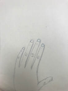
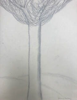
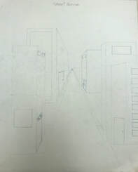
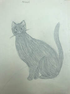
These are the first four sketches I did in this class. I drew a hand, a tree, a city, and a cat.
|
|
|
|
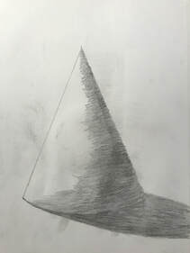
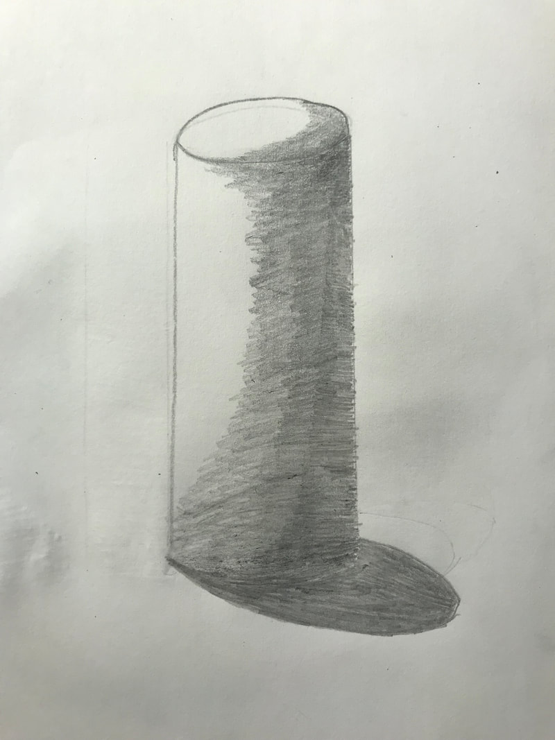
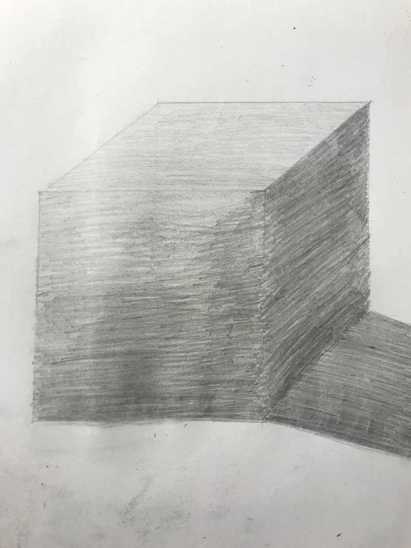
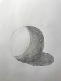
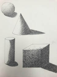
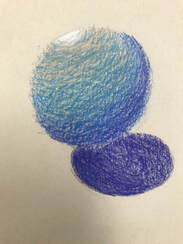
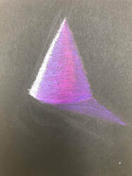
This assignment was to draw a cone, a cylinder, a square, and a circle and shade it in and add shadows. I learned a lot about shading and value because of this lesson.
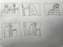
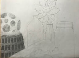
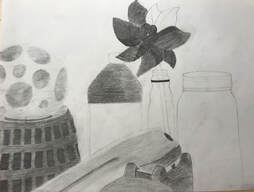
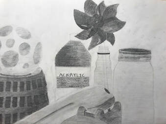
Pencil Still Life
|
|
|
- Describe how you arranged your composition. Discuss your use of the elements and principles. Is it a successful composition? I drew the still life from my perspective in the room. I used space to place the objects on the paper and shading to fill the objects in. I think it is a successful composition.
- Did you use a wide range of values? (A range from white to black with at least 9 values). Explain how is this evident? I did use a wide range of values. This is evident because you can see all the different values, the lighter and darker spots on the objects.
- Explain how your knowledge and creating practice studies with value contributed to your piece. Creating practice sketches helped me envision my final drawing. Practicing with value helped me shade each of the objects better.
- Describe the blending and transitions in your objects (discuss your use of pressure with pencil and other techniques to achieve this). The only tool I used in this project was pencil. I used the different pencils, 3H-6B, to transition to a darker or lighter shade or pressed harder or lighter on the pencil I was using.
- Explain how your interpretation of texture is essential in capturing the look of the object. I shaded in the objects based on how the object was shaped. The texture goes with the object.
- If you could recreate your pieces what would you do differently to enhance the final outcome? If I had to redo this project, I would pay a little more attention to detail. I also might choose a different angle to draw the still life from.
Final Artwork:
|
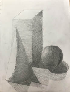
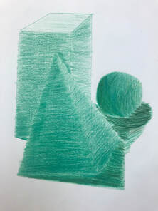
This assignment was to draw and shade the shapes and shadows of the three objects on our table. The one on the left was drawn in pencil and the one on the right was colored with colored pencil. This lesson helped me with shading and overlapping shadows.
|
|
Pen Practice
|
|
|
|
|
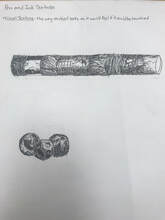
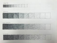
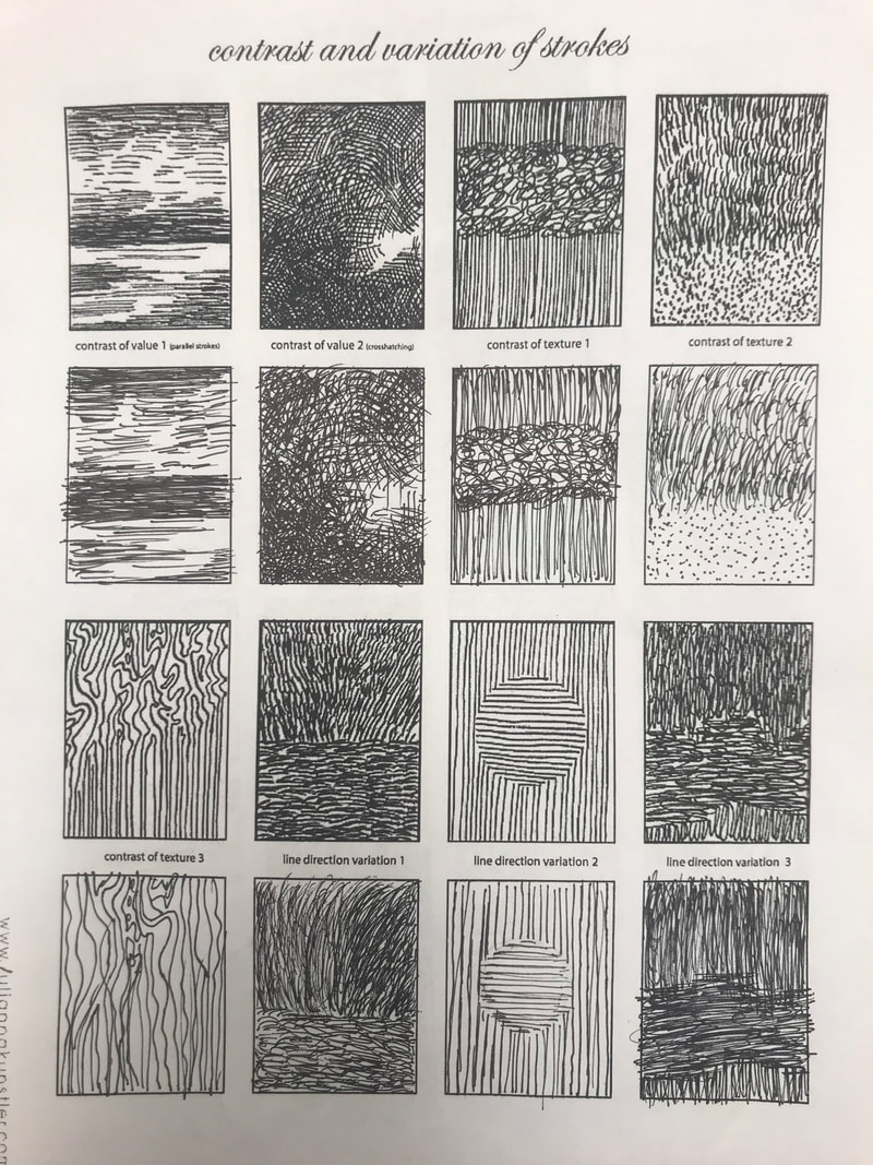
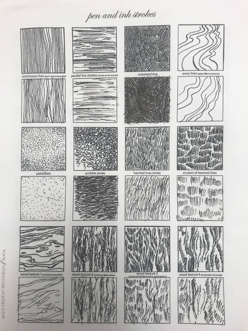
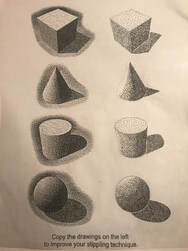
The first picture shows value charts; the first one is stippling, the second is hatching, the third is cross-hatching, and the last is one I invented. The next two pictures are texture worksheets. The fourth picture shows four shapes, each one showcasing one of the shading techniques from the value charts. The next picture is a worksheet on stippling. The last picture is the drawings from the two videos we watched in class; the textured cylinder and spheres. All of these exercises helped me learn new ways of shading with pen.
|
|
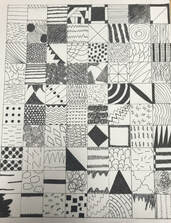
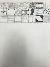
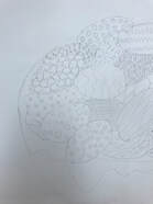
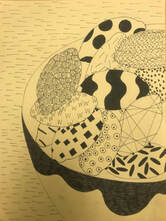
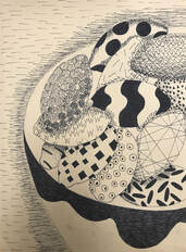
This is the one-hundred square project. We had to come up with one-hundred different patterns in one-inch by one-inch squares. I enjoyed creating patterns, but it was hard to come up with that many different ones.
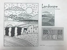
I used a few of the patterns from the one-hundred square project to fill in the landscape.
Pen and Ink Patterns
|
|
|
|
|
|
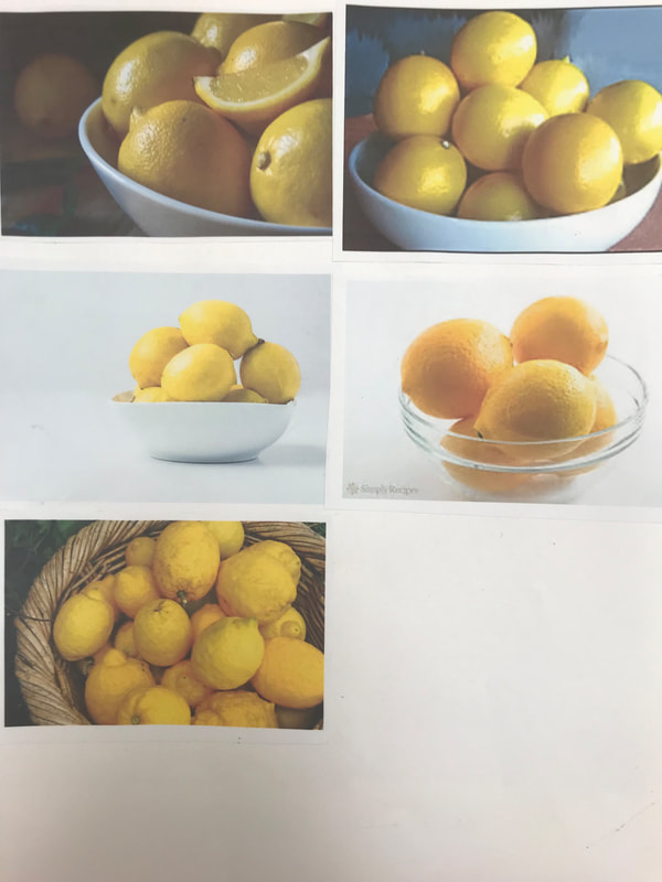
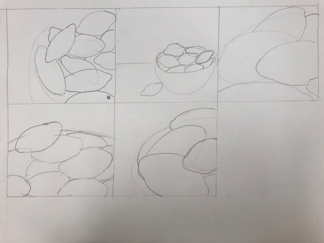
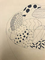
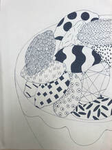
- Describe how you arranged your composition. Discuss your use of the elements and principles. Is it a successful composition? I used the reference photos and my compositional sketches to create a new composition of lemons in a bowl for this pen and ink project. Value, space, and texture are the elements of art that are used the most in my artwork. I would say that it is a successful composition.
- How is texture and pattern are important in your composition? Texture and pattern are important because they make up the composition. The patterns from the one-hundred square project create a certain texture to the lemons that are important to the composition.
- Why is value so important in this project? The different values of the patterns help distinguish one lemon from another so you can tell them apart. I used light, dark, and medium values in this project. To create more value, I added cross-hatching, hatching, or stippling to some of the patterns on the lemons.
- Describe your craftsmanship (How well the project is crafted technically). Before I went over my drawing in pen, I sketched the bowl and the lemons in pencil in case I made any mistakes. Then I traced the lines with a sharpie pen and created the patterns and values.
- Explain how your knowledge and creating practice studies with value and pattern contributed to the success of your piece. Doing practice sketches helped me create my final artwork. They were the foundation of my design. I did five sketches for my idea of starfish underwater and five for a bowl of lemons before deciding to do the lemons as my final project. Doing the one-hundred square project before this project was helpful because I just had to choose the patterns I wanted to use.
- When applying the pen and ink/pattern techniques why and how is it important to make sure you understand the concepts taught in class? It is important to make sure you understand the concepts taught in class so you can create a successful final product of your artwork. The pen and ink patterns and techniques help make the project great. I used the techniques of cross-hatching, hatching, and stippling, which were concepts taught before this project, to help make my drawing better.
- As a growing artist how do you think what you have learned will guide and better your future projects. Explain. What I have learned through this project will definitely help guide and better my future projects. I learned a lot about pen and ink techniques because of this project. This knowledge will help further my success in other projects, just like what I learned before helped me with this project.
- If you could recreate your piece what would you do differently to enhance your final outcome? If I had to recreate my piece I might choose to use different patterns for the lemons. I would draw from a different perspective or have something else for the lemons to be on.
Final Artwork:
Primsa/Pastel/Watercolor
|
|
|
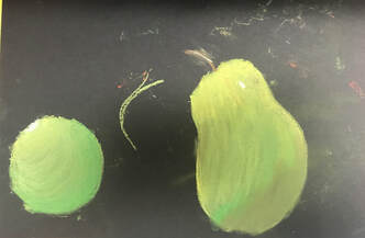
These objects are practice sketches for working with prismacolor colored pencils.
|
|
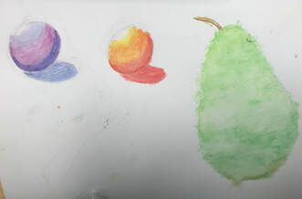
The first image shows practice with pastels and the second one is practice with watercolor pencils.
Final Drawings:
|
|
|
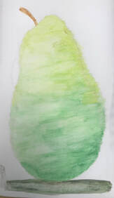
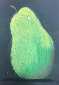
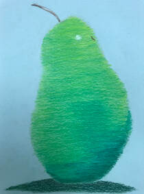
These are the final drawings of the pear. The first one is watercolor, the second one is pastel, and the third is a prismacolor drawing. Watercolor was the hardest to work with in my opinion, and I thought pastel was too messy. My favorite medium was prismacolor because it was the one you had the most control over.
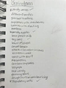
Colored Pencil Candy
|
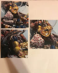
|
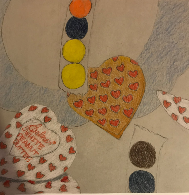
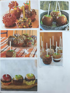
This is the candy mini-project drawing with prismacolor. and the reference photos I used.
Colored Pencil Final
|
|
|
|
1. Describe how you arranged your composition. Discuss your use of the elements and principles. Is it a successful composition?
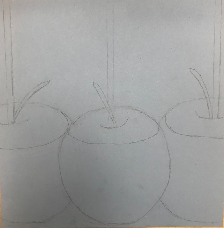
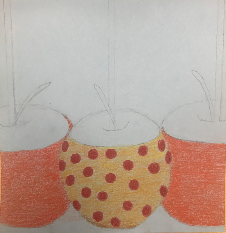
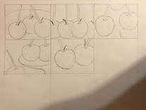
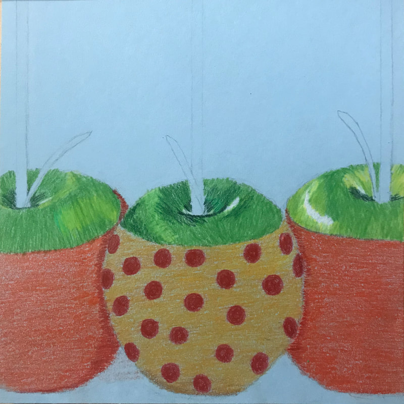
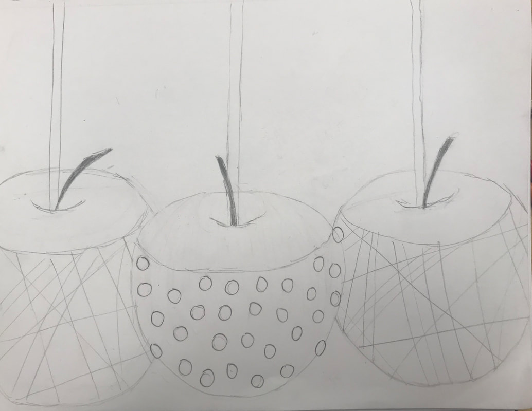
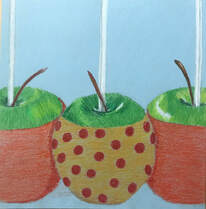
I drew three candy apples next to each other using prismacolors. The elements and principles of texture, color, and value are the ones I used the most in my drawing. I would say it is a successful composition.
2. Did you use a wide range of values? (A range from white to black with at least 9 values). Explain how is this evident?
I think I did use a wide range of values, especially of green. You can see the different shades of green on the apples, which is how it is evident. I also used different values of red for the candy.
3. Explain how your knowledge and creating practice studies with value contributed to your piece.
Practicing with prismacolors before doing this project was definitely helpful in creating the final artwork. Doing the reference sketches was helpful in creating the final drawing. I used skills learned from previous exercises to creative a successful artwork.
4. Describe the blending and transitions in your objects (discuss your use of pressure with pencil and other techniques to achieve this).
I blended the colors next to each other together in order to have smooth transitions for color to color. I applied lighter pressure to areas I wanted lighter and harder pressure to areas that needed to be dark.
5. Explain how your interpretation of texture is essential in capturing the look of the object.
The texture is essential in capturing the look of the object; it is unique to each object. I tried to make the texture of the apples and the stems look realistic.
6. If you could recreate your pieces what would you do differently to enhance the final outcome?
If I had to recreate my piece I think I would choose a different candy covering for each of the apples and add some different colors. I would also try a new composition.
Final Artwork:
Printmaking
|
|
|
|
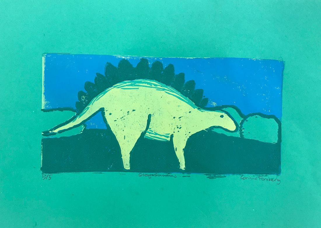
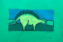
1. Describe the craftsmanship of your prints. (How good the project is technically crafted)
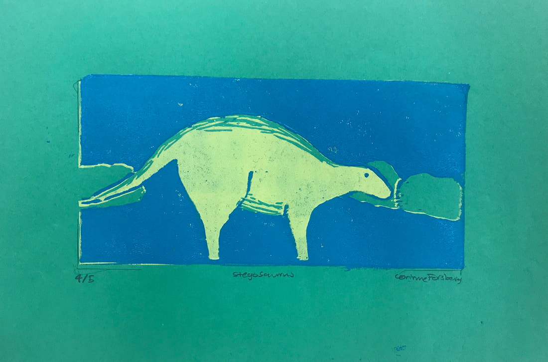
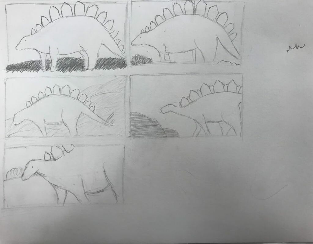
-registration and carving: I think i did a good job carving out the linoleum. That was probably my favorite part of this project. The registration marks were supposed to help line up the print, but for me it was still difficult to do that.
-burnishing and ink coverage: I tried to use enough ink on the linoleum but sometimes the print didn't transfer on the paper as well as I hoped.
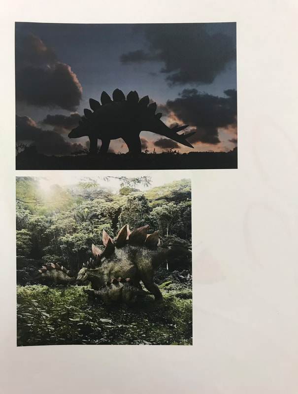
2. How did you use texture, color harmony and balance to define your choice of subject?
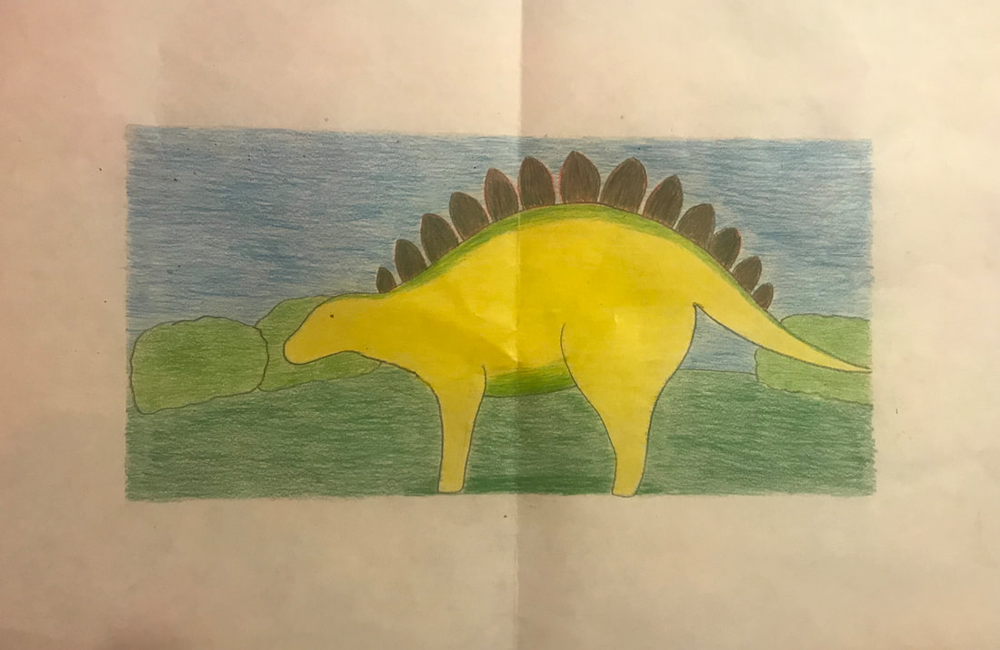
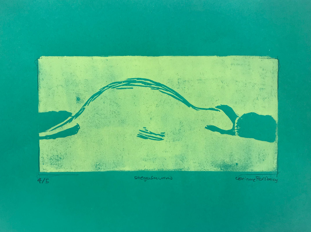
-texture: I made green texture lines on the stegosaurus for texture.
-color harmony: I tried to choose colors that worked well together in my artwork. I used light green, dark green, yellow, blue, and black for the outline.
-balance: The stegosaurus is off to the left with two bushes on the right and one on the left to try and balance the picture out.
3. If you could recreate your pieces what would you do differently to enhance your final outcome?
If I had to recreate my pieces I might choose a different color scheme and a different color for the background.
-registration and carving: I think i did a good job carving out the linoleum. That was probably my favorite part of this project. The registration marks were supposed to help line up the print, but for me it was still difficult to do that.
-burnishing and ink coverage: I tried to use enough ink on the linoleum but sometimes the print didn't transfer on the paper as well as I hoped.
2. How did you use texture, color harmony and balance to define your choice of subject?
-texture: I made green texture lines on the stegosaurus for texture.
-color harmony: I tried to choose colors that worked well together in my artwork. I used light green, dark green, yellow, blue, and black for the outline.
-balance: The stegosaurus is off to the left with two bushes on the right and one on the left to try and balance the picture out.
3. If you could recreate your pieces what would you do differently to enhance your final outcome?
If I had to recreate my pieces I might choose a different color scheme and a different color for the background.
Final Artwork:
Paintings in the Style of a Famous Artist
| art_2_famous_artist.docx |
Clay Food
|
|
|
|
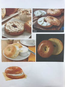
|
|
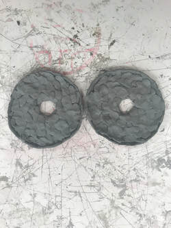
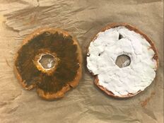
1. Describe the craftsmanship of your sculpture. (Is it neat and well executed?)
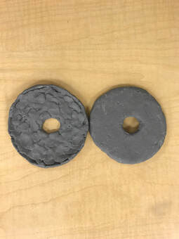
My bagel exploded in the kiln and I had to glue it back together so it looks a little messy. I couldn't find all the parts, but i think it looks good considering that.
2. What was the most difficult part of this project?
I would say the most difficult part of this project was trying to shape the clay. It was difficult for me to get the clay to look exactly how I wanted it to, especially when it became dry.
3. Did your color choices work together harmoniously?
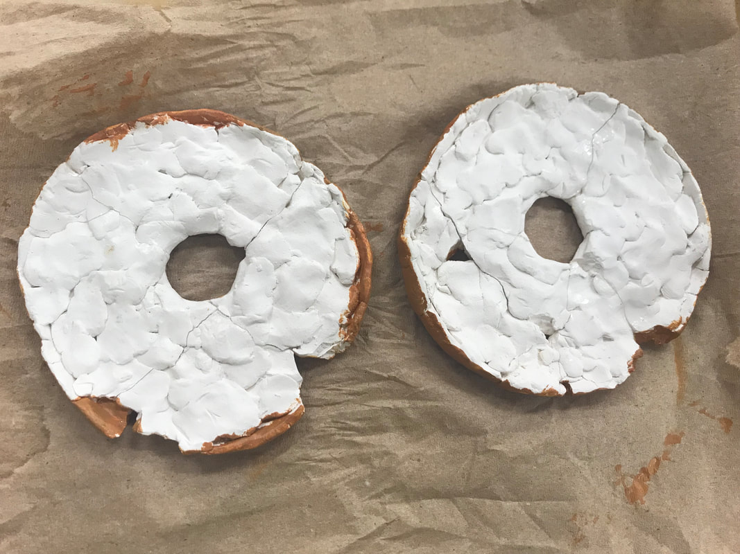
I think my color choices do work together harmoniously. I painted the bagel light brown and the cream cheese a pinkish white.
4. Is your sculpture interesting from all views?
I would say my sculpture is interesting from all views. The top of the bagel has the cream cheese and the bottom has dark brown in contrast to the light brown.
5. Describe the differences in constructing a sculpture and doing something 2D.
When making a sculpture you have to shape all sides of an object. You can pick up a sculpture and look at it from any angle. When doing something 2D you only see the angle you draw from.
6. How did you create textures in your sculpture?
I created the texture of the cream cheese by shaping the clay on top to make it look like cream cheese. For the back of the bagel, I used dark brown against the light brown color of the whole bagel.
7. Does your sculpture look like the actual food? How did you accomplish this?
I think my sculpture looks close to a real bagel. I tried to make the color scheme and the shape of the bagel as realistic as possible.
8. What would you do differently if you were to do this project again?
If I had to do this project over again, I might choose a different food to sculpt. I might also paint a different type of bagel or a full one instead of one that's cut in half.
My bagel exploded in the kiln and I had to glue it back together so it looks a little messy. I couldn't find all the parts, but i think it looks good considering that.
2. What was the most difficult part of this project?
I would say the most difficult part of this project was trying to shape the clay. It was difficult for me to get the clay to look exactly how I wanted it to, especially when it became dry.
3. Did your color choices work together harmoniously?
I think my color choices do work together harmoniously. I painted the bagel light brown and the cream cheese a pinkish white.
4. Is your sculpture interesting from all views?
I would say my sculpture is interesting from all views. The top of the bagel has the cream cheese and the bottom has dark brown in contrast to the light brown.
5. Describe the differences in constructing a sculpture and doing something 2D.
When making a sculpture you have to shape all sides of an object. You can pick up a sculpture and look at it from any angle. When doing something 2D you only see the angle you draw from.
6. How did you create textures in your sculpture?
I created the texture of the cream cheese by shaping the clay on top to make it look like cream cheese. For the back of the bagel, I used dark brown against the light brown color of the whole bagel.
7. Does your sculpture look like the actual food? How did you accomplish this?
I think my sculpture looks close to a real bagel. I tried to make the color scheme and the shape of the bagel as realistic as possible.
8. What would you do differently if you were to do this project again?
If I had to do this project over again, I might choose a different food to sculpt. I might also paint a different type of bagel or a full one instead of one that's cut in half.
Final Artwork:
Painting
|
|
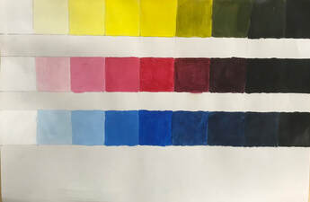
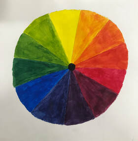
The first image is the value charts for the primary colors yellow, red, and blue. The second image is the color wheel.
